I'm Loving This New Shade of Gouache
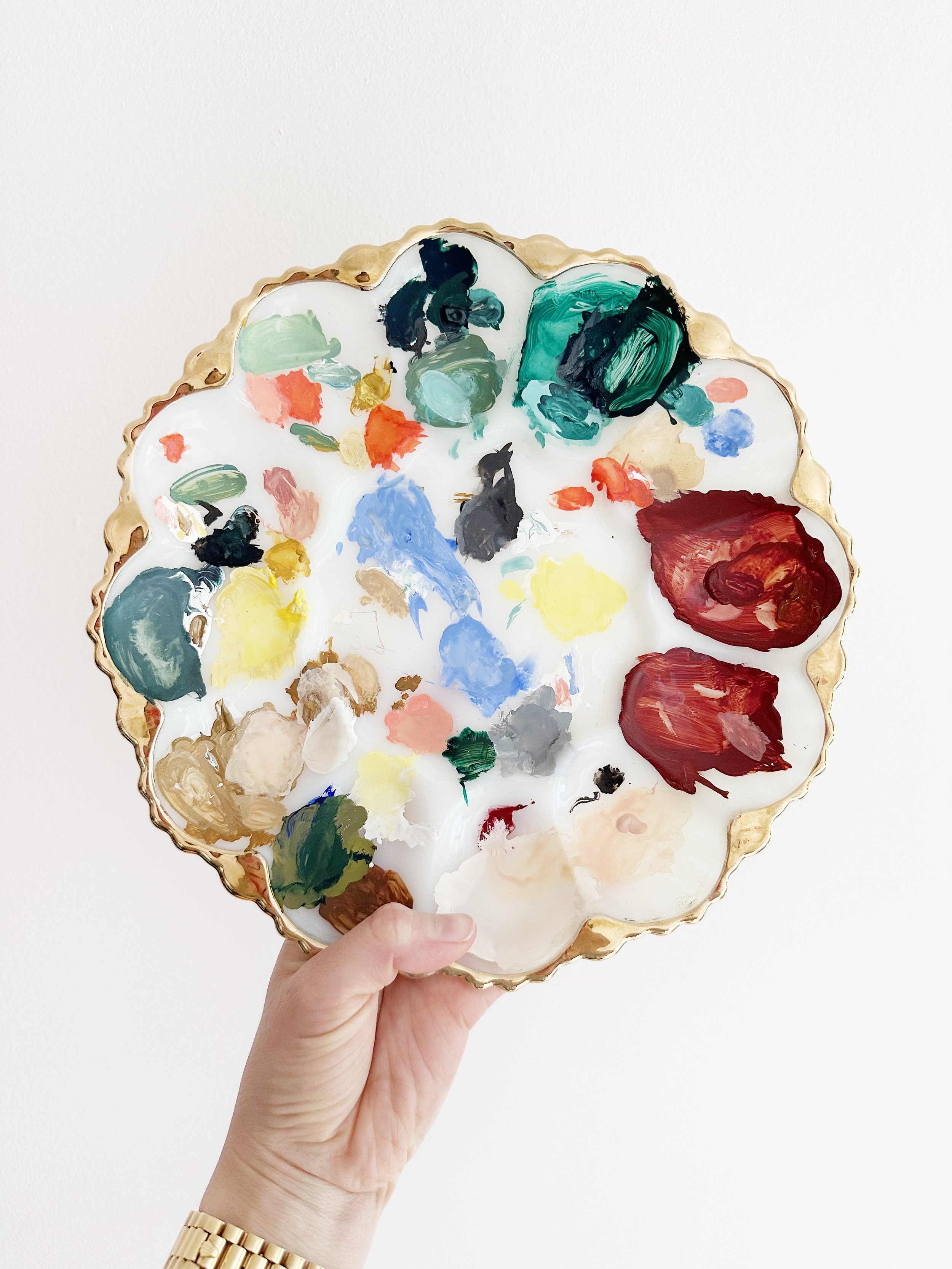
This month, on The Green Paint Society, I’m talking all about color - how I use it in my work, what shades I love, and how we can approach color more intentionally as artists. As part of this month’s challenge, I’ve asked my members to experiment with new colors. As usual, I’ve accepted my own challenge, looking for new shades to add to my palette. As someone who’s been stuck on the same shades of gouache for years, this wasn’t easy. However, it’s been extremely rewarding. I find searching for new colors gives me renewed interest in my work. It can take me out of an art rut pretty quickly.
You all know I’m a die hard Winsor & Newton fan, so that’s the only brand of gouache I’m trying out when looking for new shades. For the best place to buy gouache, I find Dick Blick online has the best prices. If you have a Dick Blick store near you, I recommend stopping in. It’s a magical place!
Okay so ready for the new shade I’m loving…Drumroll…
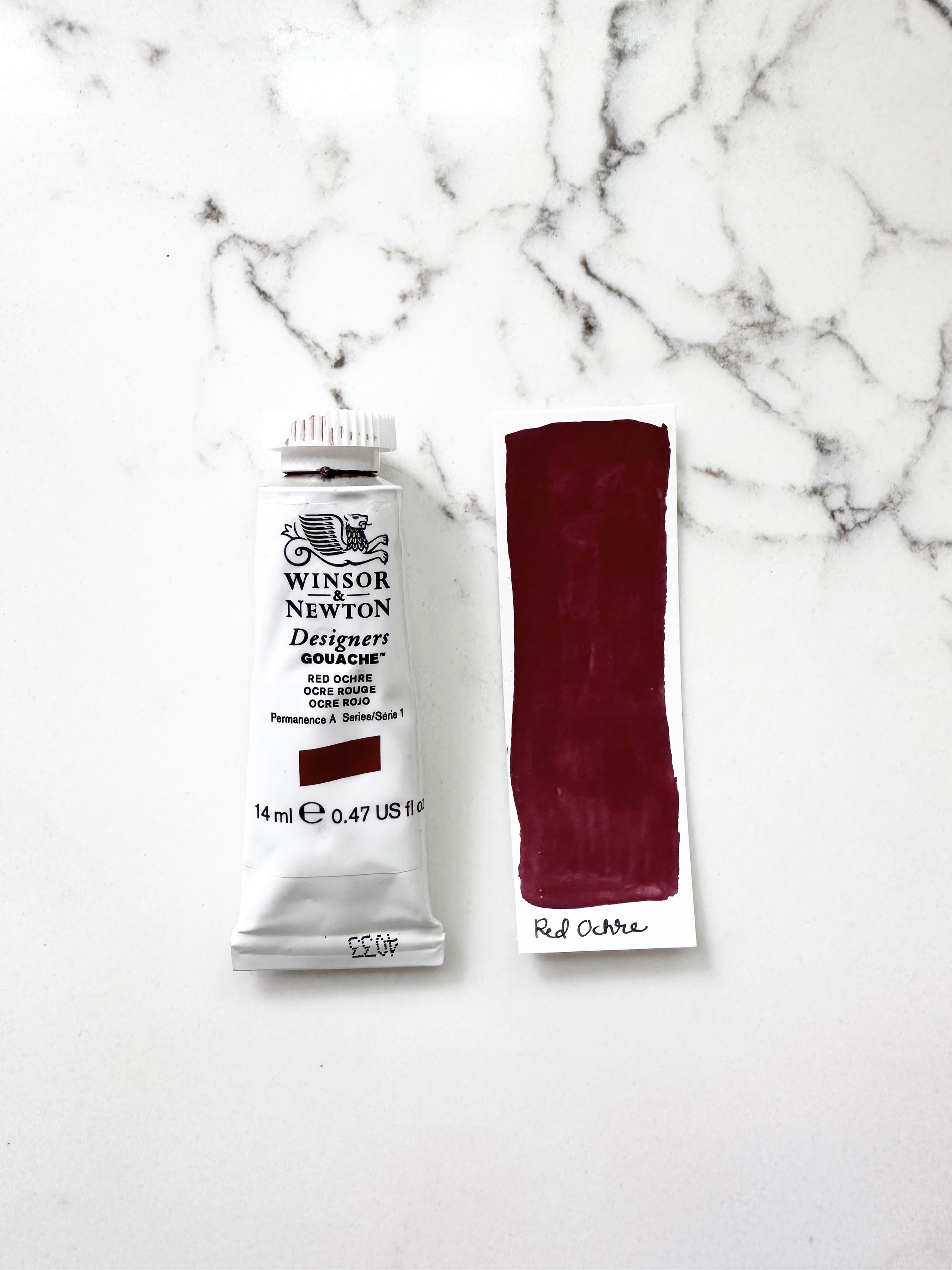
It’s Red Ochre!
To me, this feels like the perfect fall shade. It’s a great middle point between maroon and burnt sienna. It’s that perfect warm reddish brown that has a lot of depth. It reminds me of red wine, autumn leaves, and apple pie.
When looking for shades I love, it isn’t just about the color itself. Each shade comes with a unique texture and opacity. It’s just the way color formulas are made. Some shades are more runny and transparent, which I don’t love. Others are thick and opaque, which is what I’m looking for. Some of you may know, I also recently discovered Winsor Green, which has replaced my beloved Viridian in my palette. This decision was simply based on the paint texture. Winsor green is more thick and opaque. I like the application much better than Viridian.
When it comes to texture and transparency, Red Ochre is perfection. It’s thick, smooth, and super opaque.
I can see myself using this shade in a lot of holiday work too, because it’s the perfect compliment to my greens. Usually, I would just default to my bright red, but I love the richness and earthiness Red Ochre has to offer. It gives my work a more moody feel.
Red Ochre mixes great with other colors too - like Burnt Sienna if you want something slightly more orange. Because it’s a more muted shade, it serves as a great neutral foundation, allowing the brighter shades in your work to pop.
So next time you’re at the art store, check this shade out. I think you’ll love it as much as I do!


Thanks for stopping by! I’m an illustrator & writer. I’ve been running my own creative business since 2015. My mission is to help artists find their unique creative voice, build positive habits, and do what they love for a living.