My Take on Neocolor Pastels
It seems like Neocolor pastels are all the rage lately, and I can see why. They’re super pigmented and versatile, making them a wonderful addition to any medium. They work particularly well over watercolor and gouache, but also in conjunction with acrylic, marker, and colored pencil. Really any medium on paper is a great match.
Earlier this year, it felt like every artist was talking about these pastels online. Naturally, I was curious to try them out. As I do with all art supplies, I chose a handful of colors I thought I’d like (versus buying a set) - colors I already enjoy using in gouache.
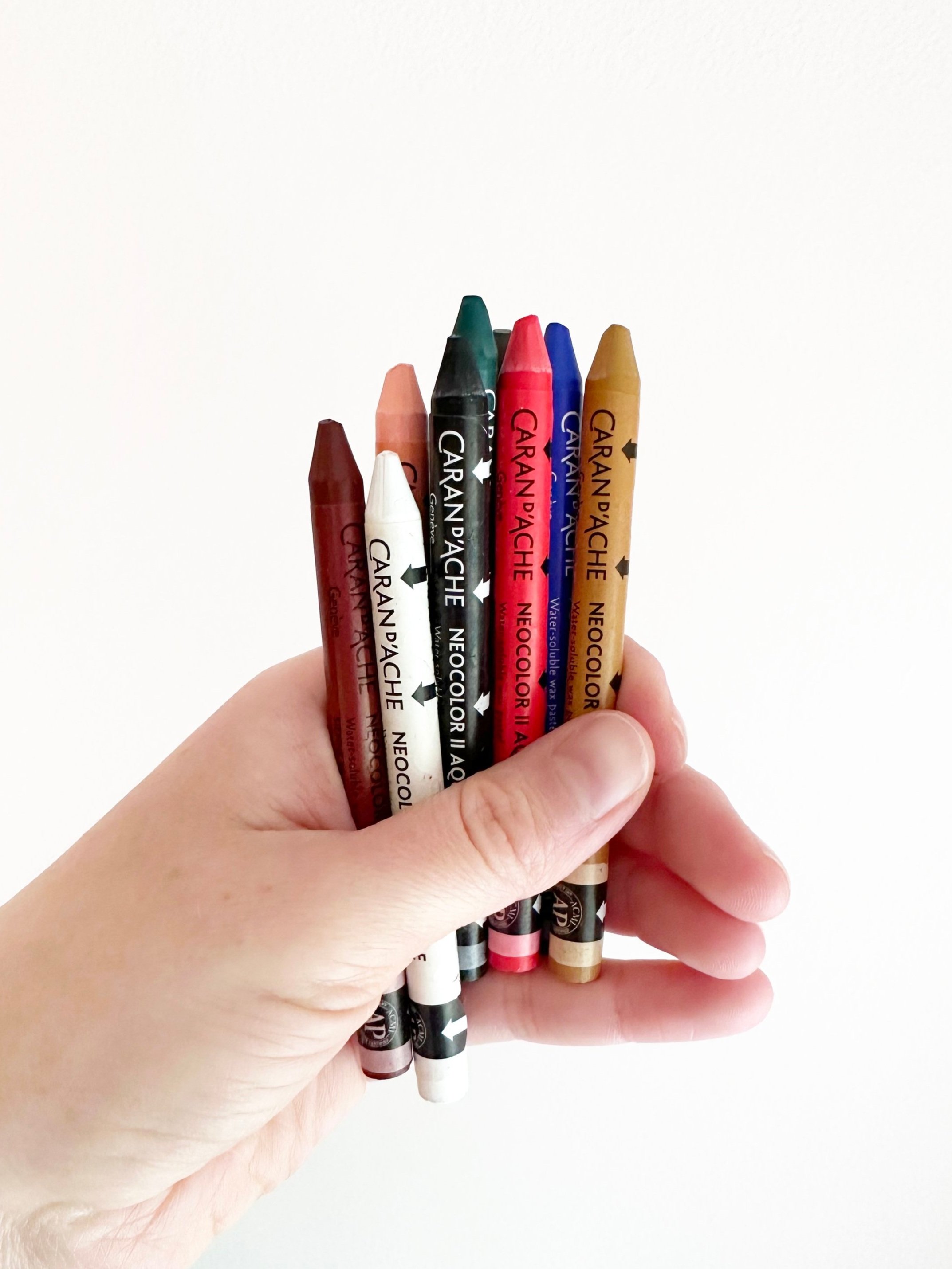
Here are the 9 shades I picked out:
Salmon
Light Cadmium Red
Burnt Siena
White
Umber
Noir
Ultramarine
Dark Green
Ochre
These sticks are pretty affordable at $1.58 a piece, and I’ve found they go really far.
First off, a little background on this medium. At first I was confused which version of Neocolor pastels to purchase - I or II. After a quick google search, I discovered that Neocolor I pastels are not water soluble, whereas Neocolor II are. To me, the water solubility is an added bonus, since you don’t necessarily have to put water over them. Also, it seemed like Neocolor II pastels were the ones I saw trending, so I went with those. And I was not disappointed.
Upon receiving my pastel order from Dick Blick, I first noticed how pigmented these pastels are. They pack a big color punch. To me, they are harder than your typical oil pastel (which offers more control and less mess), but softer than a crayon. They’re basically crayons on crack. They are the perfect texture. And when you add water, which I haven’t done too much because I enjoy the texture, they take on the form of a very pigmented watercolor. The tones become even brighter when wet than dry. Also, when you apply the water, the texture almost completely dissolves, resulting in a dsmooth application. This felt pretty magical to me.

The way I’ve been using these pastels is over my gouache paintings - mostly to add texture or lighting effects. It’s similar to the way I use Prismacolor colored pencils. A negative to these pastels versus colored pencils is that they’re not ideal for detail work because the tip is thicker and more uneven. They definitely work better for a larger, looser application.
Because of the way I’ve used my Neocolor pastels, I’ve used the neutral shades the most - like black and white. If you are looking for two shades to start with, I’d go with those. I’ve only used a wet application when trying to smooth out areas where I’ve overdone the texture and it’s worked great.
Here are examples of how I’ve used this medium in my work:

I used Neocolor Pastels on this piece in my sketchbook, along with colored pencils to add texture to the painting.

In this painting, I used Neocolor pastels for the lighting effects on the lawn and in the sky.

In this painting, I used Neocolor pastels for the sunset in the sky (wet application), and for the shading in the grass.
I would definitely recommend this medium if you’re looking to try something new that’s affordable and versatile. They are one of the coolest things on the art market right now. I can’t see who wouldn’t love them. Also, they’re portable and don’t make a mess, which is something I’m always looking for in a medium. While I couldn’t see myself using these pastels as my primary medium, I plan to keep them as part of my process for years to come.


Thanks for stopping by! I’m an illustrator & writer. I’ve been running my own creative business since 2015. My mission is to help artists find their unique creative voice, build positive habits, and do what they love for a living.